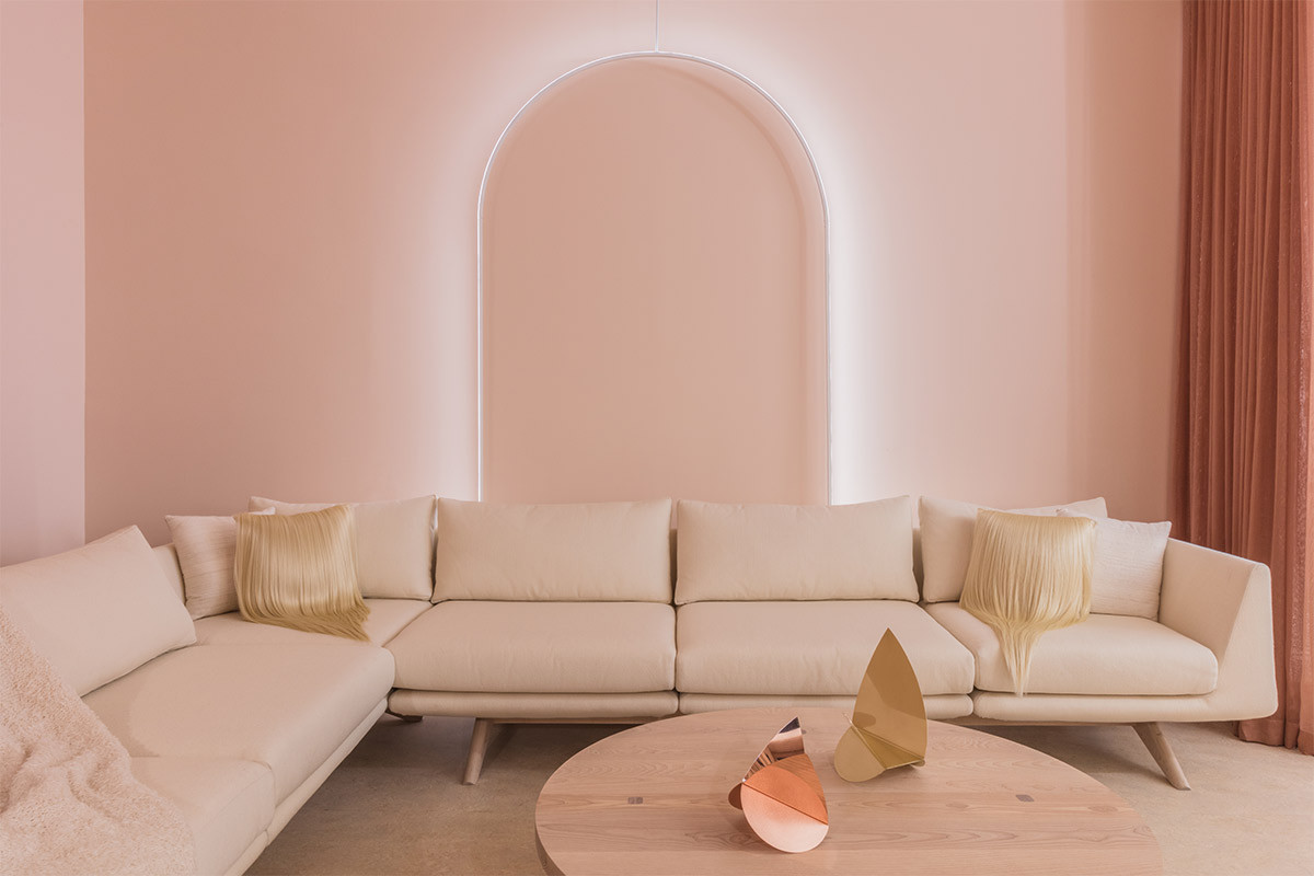
Hidden Space: Outlines
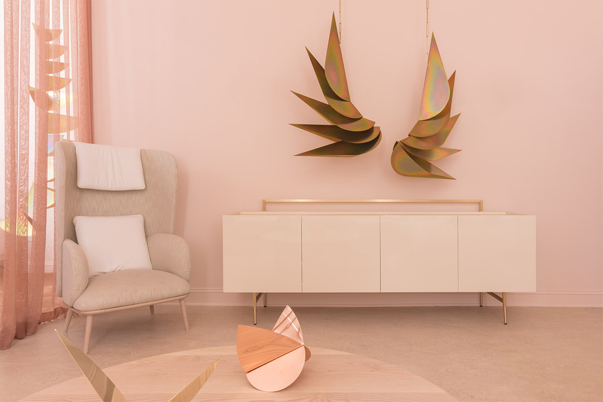
Outlines, the debut show at our new, somewhat secret NoHo showroom, opened with a splash during May’s design week. The inaugural exhibition, designed with pink abandon by our friend Leilani Zahn, combined custom De La Espada furniture, a barrel-vaulted lighting scheme and plenty of bespoke touches by Zahn and her friends (including Brittany Asch, Natalya Zahn and the designer’s husband Karl Zahn). Here, we discuss Leilani’s inspirations for the project
Photography by Lauren Coleman.
1. What was the genesis of the collaboration between you and The Future Perfect?
I was looking to find new inspiring projects to work on and I believe it was David who asked if I was interested in curating the new showroom with De La Espada. It gave me a chance to work on a more aspirational and conceptual interior concept as well design new products.
Photography by Lauren Coleman.
2. What was your approach to the space and meeting David’s brief?
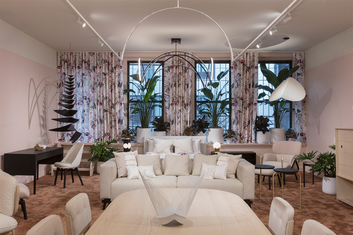
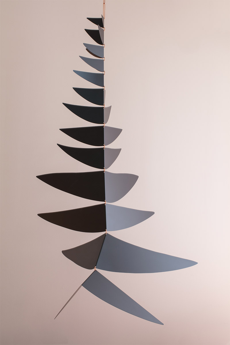
The process was to create an experience that reflects my practice as an interior designer. I had the unique challenge of being both the designer and the audience. I first see furniture as shapes and lines in projects. The furniture’s unique personality is further defined by adding specific fabrics and finishes, but as designers, we are always drawn to form first. I chose to style the gallery in varying shades of white to highlight these forms, then added sculptural elements to activate the shapes further and add interest to an otherwise neutral palette. To balance the richly textured minimalism we also curated a selection of work from Karl Zahn that was based on an exploration of plants and added a nature element to the environment.
Photography by Lauren Coleman.
3. I particularly loved the lighting scheme, which anchors the space and gives it a more residential feel. How did you come up with the concept?
In our calm sea of white shapes, we endeavored to add some dramatic interest to the upper half of the space (ie. ceiling), originally intending to construct a barrel vault through the second room. In drawing up the plans, we had a thought - why can’t the vault BE a light? The result is an elegant lighting concept, simple lines of light that replicate barrel vaults, cloister vaults, and archways to illuminate the space - creating simple architectural detail without walls.
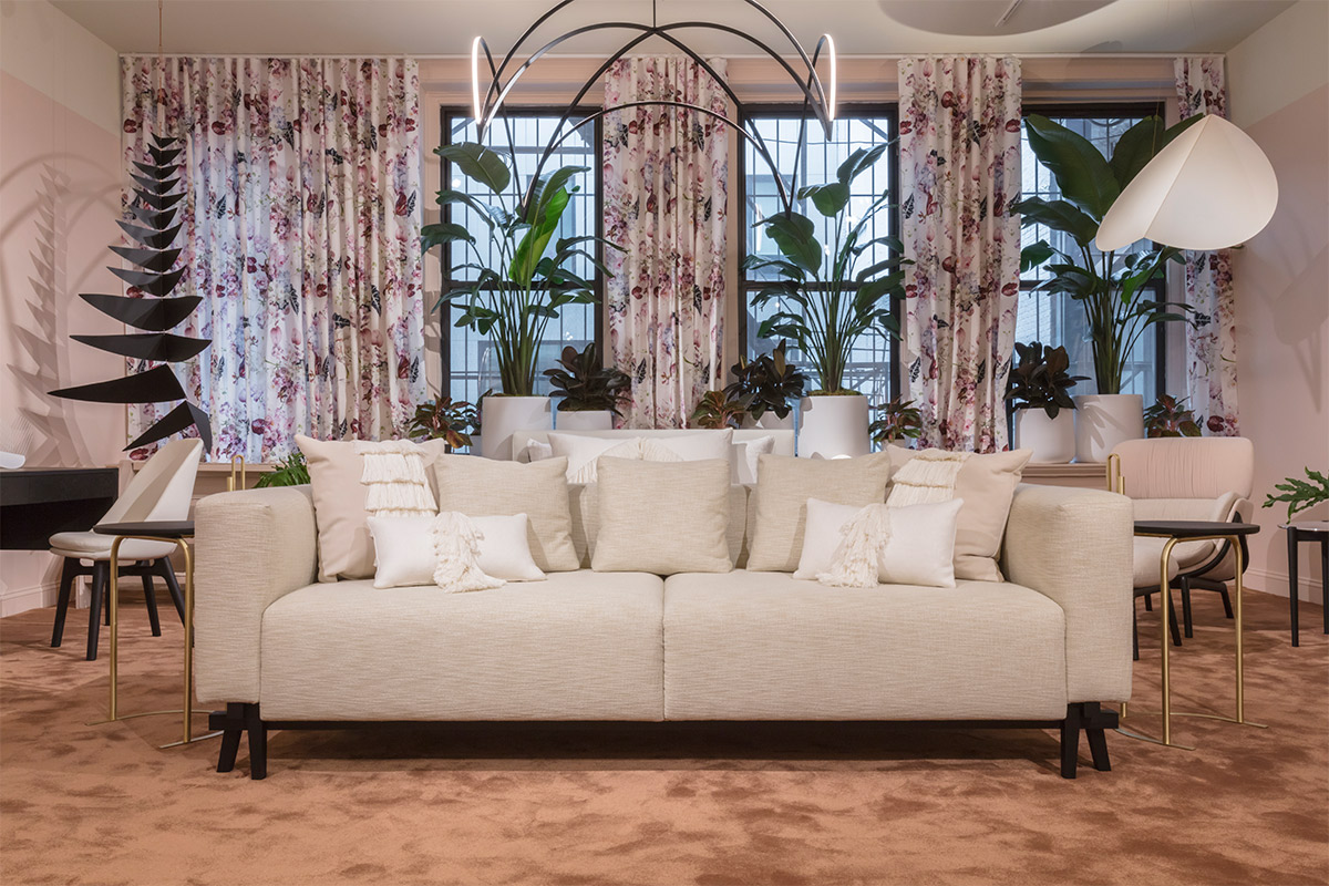
Photography by Lauren Coleman.
4. The hair pillow has received a lot of attention. How did this come about?
It was an exploration of material and a play on a fringe theme we had repeating with the soft goods. By displaying the material as a designed object the lines between the beauty industry, fashion world and product design are blurred and the unconventional material is able to be looked at through a new point of view.
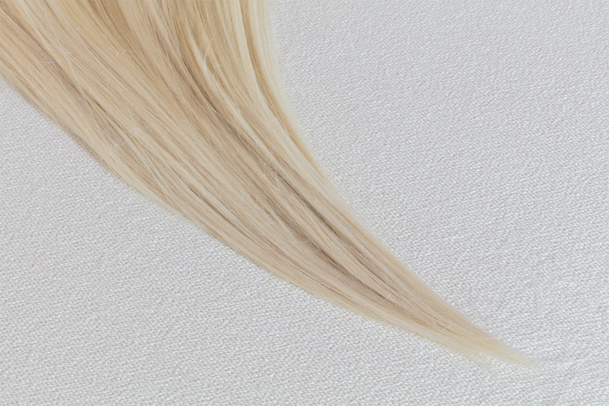
Photography by Lauren Coleman.
5. Pink seems to be very au courant (millennial pink etc). It’s also very soothing and works so well. Would you agree?
Definitely agreed. I wanted to have a soft contrast to the neutrals and the pink was definitely soothing and creates a warmth to a space.
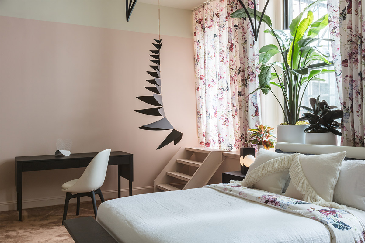
Photography by Lauren Coleman.
6. Can you talk us through any other pieces that you gravitated to for the project?
The floral pattern that we made was a real passion project. We decided to create a new floral pattern for the space to be applied as wallpaper or a hanging textile. We needed to understand each step of the process to generate a new variation on a such timeless style of pattern. Our starting point - the flowers. BRRCH created custom arrangements in her signature forms and unique flower choice. I then asked artist Natalya Zahn to hand paint the scene and create a pattern for repeat. The painted process further emphasized the balance of natural forms with a new concept. It created a traditional pattern with an update.
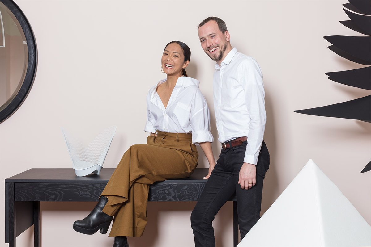
Photography by Lauren Coleman.
 The Future Perfect