Shopping with Alex P White
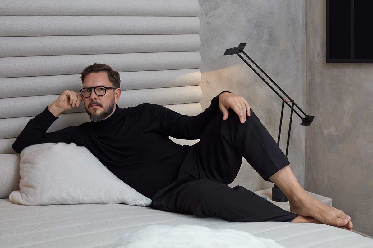
It takes just a passing glance through his Instagram to realize that Alex P White is unquestionably a triple threat: a man of style, substance and immense cultivation. The designer, who launched his own studio in 2017 after working with revered companies such as Kelly Behun Studio, balances vivacious residential projects and limited edition furniture projects, keeping this intriguing by weaving in varied pop culture references from Issey Miyake to Siouxsie and the Banshees. Any Alex P White project is guaranteed to have that certain frisson; imbued with erudite clues that extend down the annals of aesthetic culture. With his finely honed visual sense of space and dynamic, idiosyncratic nature, we’ve always thought of Alex as our ideal candidate for Shopping With…
On his TFP picks:
“One pill makes you larger, and one pill makes you small
And the ones that mother gives you, don't do anything at all.
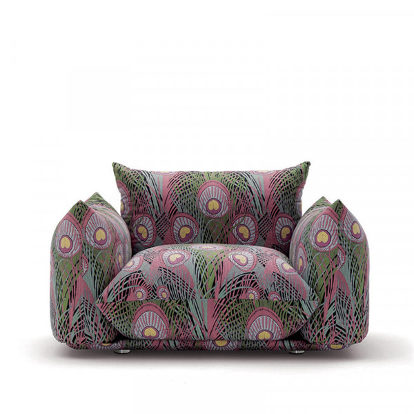
A classic! Floor pillows with structural support, what a genius idea and then with this fabric, truly inspired. Love when the 70’s leans a bit Art Nouveau.
It’s Flintstone chic. What can I say, I love rocks and inventiveness.
Rugs should be a work of art and there’s a lot of magic happening in this one. Love that shape with the celestial pattern. I’m always eager to see what this studio does next.
I might be stretching a bit but I see a nod to Superstudio - If they used the grid motif to critique consumer culture and the continuous drive for novelty, then Piet’s wardrobe is the polar opposite. It’s unapologetically optimistic, more a monument to “living off the grid” with that unique handcrafting and the reuse-reduce-recycle ethic so front and center. It’s also insanely beautiful.
I could soak up the sun and sip negronis on this beauty all day."
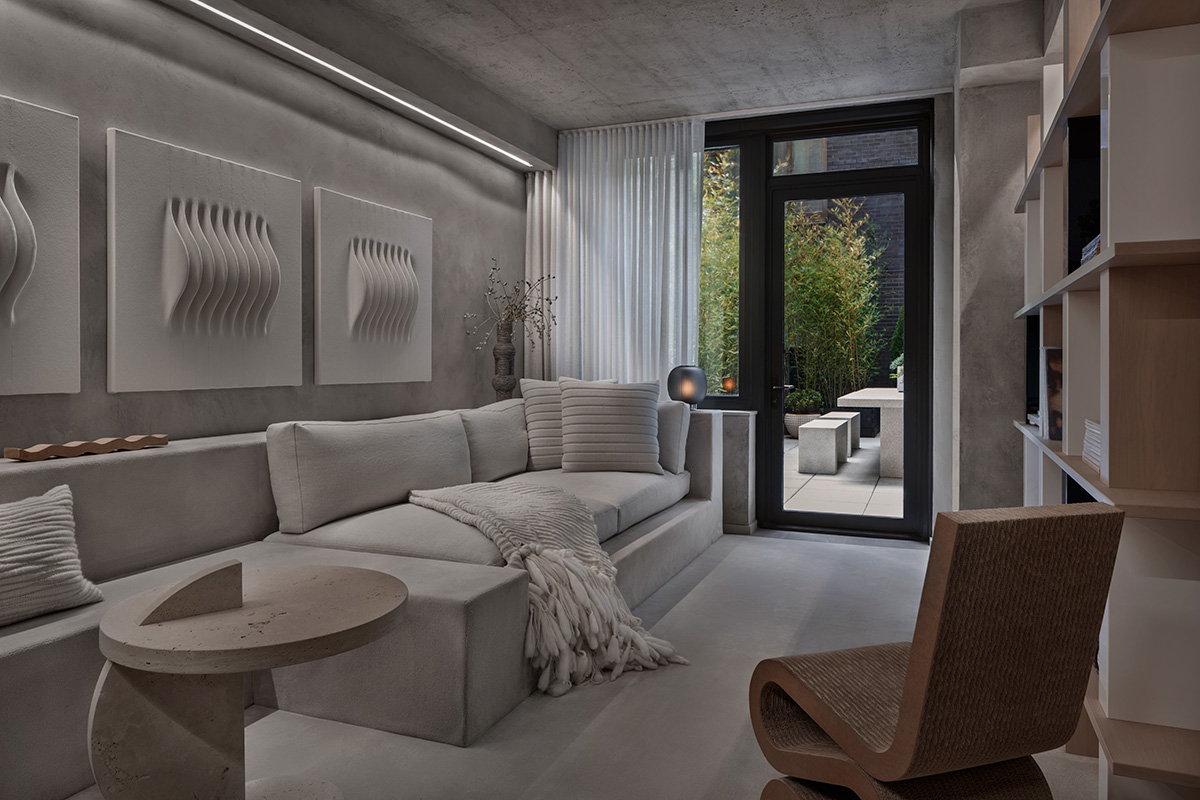
Model apartment for 196 Orchard St. Photography by Colin Miller.
Since Founding your own studio in 2017, what are some of the projects you’ve undertaken?
It’s been an unbelievable couple of years and I’m so grateful. I never expected to be this busy (and tired) but also so fulfilled - Livin’ the Dream.
I’m finishing up several residential interiors right now, a top to bottom renovation in Beverly Hills for a collector and a show apartment in the Lower East Side for 196 Orchard. I’m also super excited about designing my new studio in Silverlake. It’s a classic streamline modern c. 1936 with the coolest bathroom I’ve ever had. My partner Strauss is an artist and set up a makeshift studio in the garage so it’s pretty much a dream to go to work everyday.
I’ve also been busy with some commissions and exhibitions. My performance project SKOTE participated in a residency program at Pioneer Works in Brooklyn and completed a video commission for the artist Liz Collins at the Tang Museum. I also had some pieces in Stranger Days, a show with Bec Brittain and Material Lust. Someone in the press called us the “darklings” of design so that was pretty much a highlight.
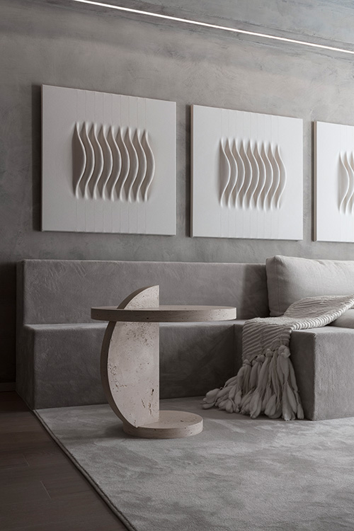
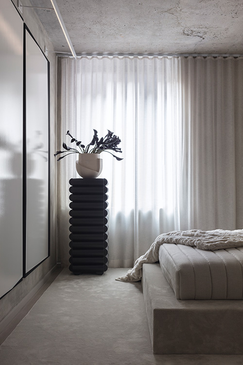
Model apartment for 196 Orchard St. Photography by Lauren Coleman.
You’re obviously a very visual person who appreciates a historical reference (and otherwise). How does this inform your work? A lot of designers say they prefer to steer clear of too many references?
For me the essence of design is historical dialog. I’d like to think I’m working in a continuum somewhere between the past and the present to achieve the best possible outcome for the future. So I bring a lot of references to project to see what resonates and to establish mood quickly. A narrative develops quite effortlessly with my clients and the references become like guideposts in the decision making process. In the end, it’s the smartest combination of references that offer the most layered, exciting experiences.
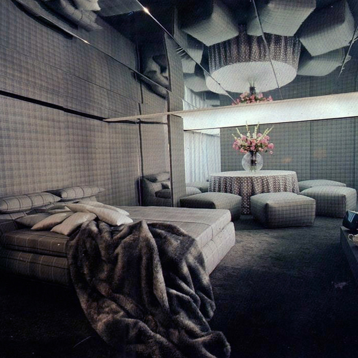
Your Instagram is epic…. Not to give too much away, but where do you find all these amazing images and what makes a suitable subject for you?
Thank you, happy to hear it inspires. My instagram is my mood board.
Printed matter of all kinds has been an obsession since forever and I have a large and growing collection of out of print books and magazines that I post. I think the Richard Prince-esque rephotography scene on instagram is fascinating. These obscure books with all this amazing photography get re-contextualized and redistributed, hopefully with credits. I really love to explore the hashtags and to see the same images reborn in all these different subtle ways. It makes them relevant again, living. Look at what happened with the rediscovery of Memphis. I started seeing it reemerge on Tumblr around 2010 and by the time instagram took over it was full on trending. It’s debatable what this is doing for the progress of design culture, definitely a panel worthy discussion for another time, right?
My inspo posts are very considered spaces that typically question some convention. A vintage image that seems a little bit more contemporary than now is always a good post and environments are better than interiors. I tend to gravitate towards vintage photography because I like the look of film and the moodier lighting. I’m also obsessed with lighting design in general and I love a sexy room at night. We just don’t get to see evening editorials enough which is a bummer considering we spend most of the time at home in the evening, so I post as many as I can find. I make sure to shoot all my work in both the day and the evening now. I’m really hoping that I can push the night time looks back into the present.
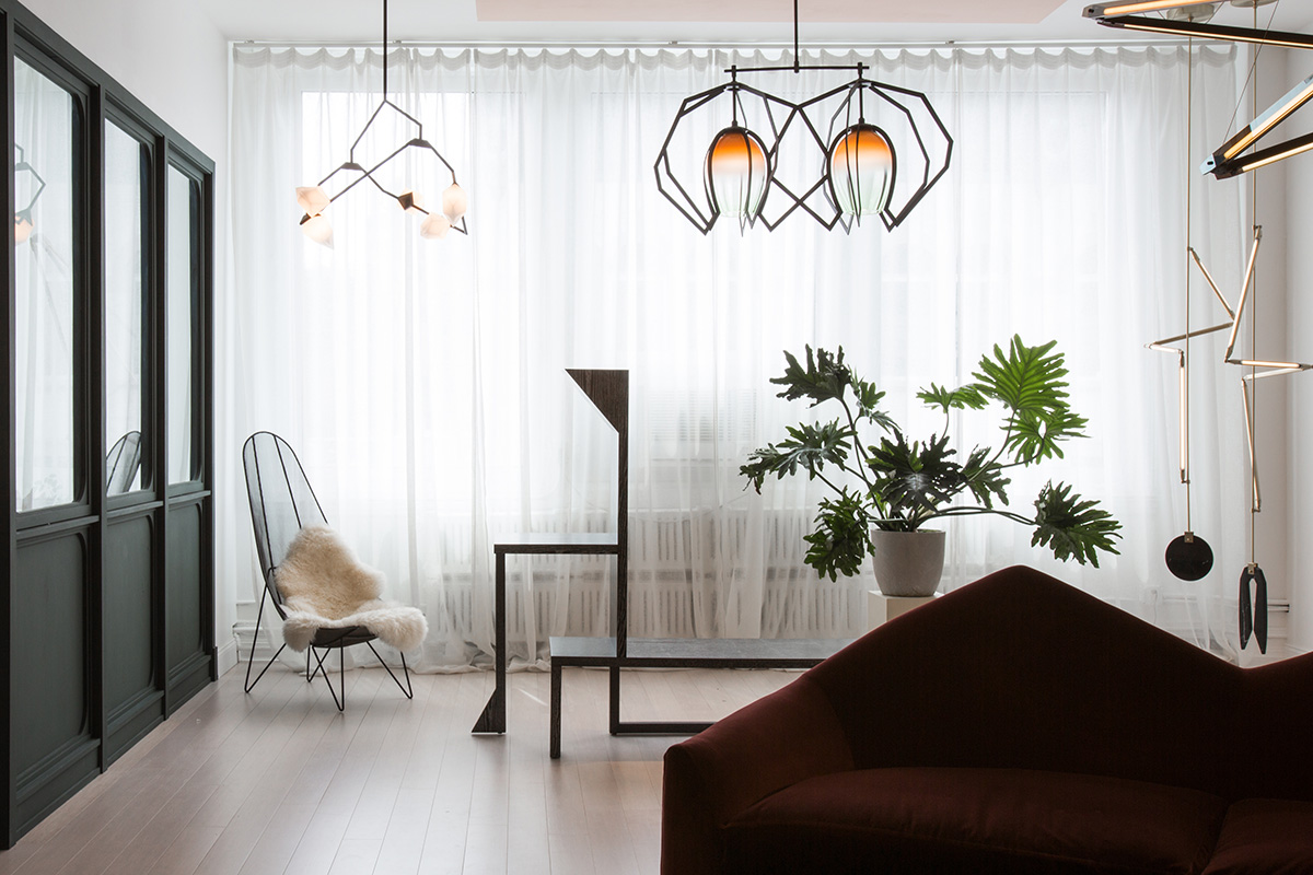
Stranger Days with Bec Brittain and Material Lust. Photography by Lauren Coleman.
Do you attract clients through your Instagram? Surely it’s a way to convey your taste in a very direct way.
Absolutely. Clients, colleagues, collaborators, friends….keeping up with my DM’s is becoming a full time job. But seriously, I’ve met so many amazing people through instagram. I have these in depth conversations happening simultaneously through DMs, TXTs and Emails, it’s a bit bonkers but I love it. For me it relates to my pre-internet geek-out zine days, just on blast. The misfit kids could find each other from all over the place and connect over the most obscure ephemera, fandoms and other identity based materials, it just took months not minutes. Anybody remember Queercore?
Anyway, Insta-space is editorial space and I think it’s so cool to have such an accessible and immediate platform to broadcast your point of view across so many cultural and geographic boundaries. Now thats epic!
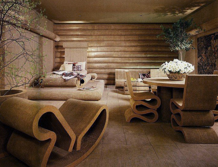
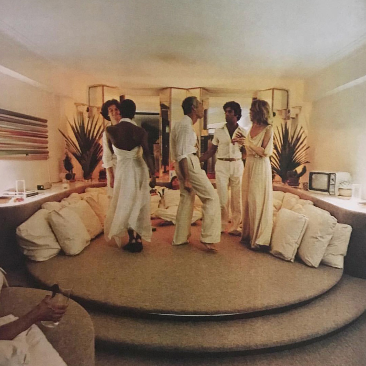
Room from Bloomingdale's Book of Home Decorating by Barbara D’arcy .
Speaking historically, what are some of the designers who inform your work today? Are there any key touchstones?
There are so many and the list is always evolving but Robert Mallet Stevens, Eliel Saarinen and Paul Rudolph are some of my favs du jour. But it’s Barbara D’arcy and her Bloomingdale's Book of Home Decorating that really has a special place in my heart. I have this imaginary honorarium where the winner receives the Incomparable Barbara D’Arcy Award. I call it out whenever an interior really knocks my socks off.
Barbara headed up visual display for the legendary furniture department at Bloomingdales in the late 60’s and 70’s. Her rooms were insane. They had an emphasis on lounging and pleasure that was totally bold. There was an appeal to the senses that bordered on mind-altering – they were happenings, they were an Experience. I mean her legendary cardboard Frank Gehry room featuring his wiggle furniture pretty much launched his career.
Most of her images are definitely floating around on insta now but sadly, many without credit which I try to correct because she was a real tastemaker and pioneer of the “retail as theater” scene. If you don’t know Barbara’s work, I encourage everyone to check out her book pronto and honor her legacy by participating in the Incomparable Barbara D’arcy Award with me. She truly elevated the practice of Interior Design to an artform.
What kind of client is attracted to the wild world of Alex P White?
My clients take their homes very seriously and love to share them as much as possible. They love to dress up, light candles and take pictures. They like to turn up the music and dance their asses off but most importantly they know how to laugh even when life gets intense. They truly respect the value of thoughtfully selecting and arranging objects in a considered space because they believe our things define us, that they tell stories about us and that they influence how we live. My clients are collectors that know every exceptional home is an experience and they know the magic can’t happen overnight. The layers must evolve like we do and It’s a process that never really ends. They embrace it.
Can you talk us through your project SKOTE?
SKOTE is a really long term art project (going on almost 20 years now) and it’s really near and dear to my heart, so this is going to be a longish answer - I hope you’ll forgive my indulgences but I love to tell this story.
It was actually my Mom who coined the term SKOTE. It was a noun and an adjective for her that described something undesirable and maybe even a little dangerous. The kids in the orange and brown house on the cul de sac were “SKOTE” so we weren’t allowed to play with them. This calling out elicited the exact opposite reaction from my sister and myself, of course. We adored anything my Mom thought was “SKOTE.” For us it was like Punk so you know we were in the cul de sac looking for mischief whenever we could sneak away.
It was one one of my oldest friends who brought SKOTE to our friend group. Lancina the Goddess of Fun aka Secrets Le Secrets was one of my Mom’s favorite and best piano students. He truly appreciated her nuttiness more than anyone else so by the end of our undergrad experience SKOTE was popular slang but it had taken on the so bad it’s good meaning or what we always called s’wrong s’right.
This was around the mid 90s and we all hung out and worked at this vegetarian restaurant in Atlanta called Homage. By day, it was a restaurant and at night it was a Bar/Music venue. It was actually my first interior design commission and I filled it with macrame, my shaggy 70s furniture collection, colored mood lighting and a wooden conversation pit that sort of resembled The Rolling Stones’ tongue meets a hot tub. Essentially we were all club kids partying like it was 1999 sporting looks like it was 1979. It’s here where I met my collaborator in SKOTE, Ms. Jill Pangallo from NYC. For style reference, we were both sporting 70s teenager runaway looks at the time, V sexy territory.
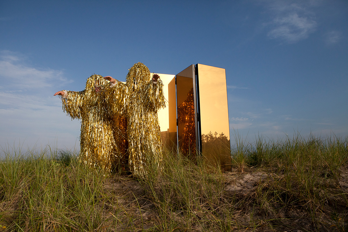
Jill and I threw the first SKOTE party in 2001 at my family’s farm outside of Athens Ga. which I might add is also home to the legendary B-52’s and all sorts of other kooks playing dress up in the woods. So SKOTE had our version of a dress up party weekend and captured it all on video. It was so fun and intense and we were surprised by how good the footage was so we just kept going with it. All those old clips are still floating around on Youtube so check them out sometime...I think they’re funny as hell, sort of Schitt’s Creek meets a Drag Race challenge.
Around 2006ish we replaced the Club with MFA programs and formalized SKOTE as an art project - mainly as a way to keep hanging out and playing dress up but we were just more focused on content so the production and presentation evolved.
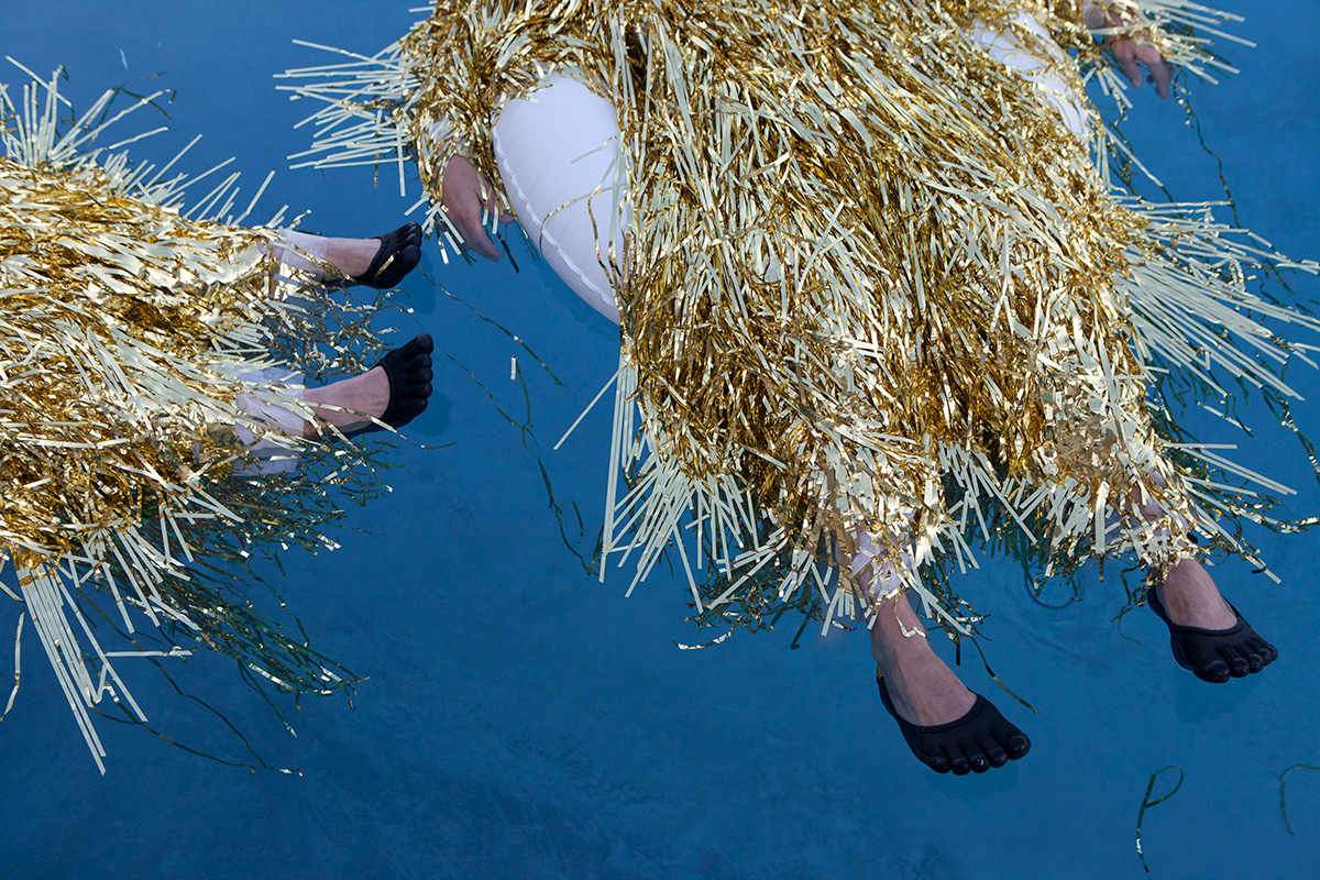
Since then we’ve performed in nightclubs, theaters, galleries, churches and public spaces, at summer camp, at art residencies and for the camera. We have staged site specific performances at storage facilities, in car interiors, dumps, abandoned condos and even Home Depot. We are always interested in the context of our performance so we film and edit the improvisational performance together as a type of intervention and choreographic space. We even did a video series once as an homage to the Radical Italians and staged video performances for some of my furniture design shows.
Our performances are silly and therapeutic as much as they are opportunities to extend reality and explore a critical engagement with both context and otherness. I sure hope we keep going another 30 years - the idea of slipping into a unitard for a performance sounds like the ideal octogenarian goal.
 The Future Perfect

