Shopping with Rafael de Cárdenas
Since founding his design and architecture firm some ten years ago, Rafael de Cárdenas has built a reputation as one of the industry’s most idiosyncratic talents. Reflecting his diverse influences - notably fashion, popular culture and film - the studio’s projects are distinguished by a sense of daring that’s matched by impeccable execution. To celebrate his firm’s formidable first decade in business, de Cárdenas has teamed up with editors Karen Marta and Felix Burrichter, art director Patrick Li and Rizzoli to release a self titled volume that’s as nonconformist as his output. On the eve of his book launch, we sat down with Rafael to talk influences, anniversaries and his favorite pieces from the Future Perfect Collection.
On his TFP selects:
I like that you can sit in the Dudina Chair in two ways. And it looks perfect for an awkward corner.
Love a Klein blue.
I'm drawn to the levity of the Table Composition from Michael Anastassiades.
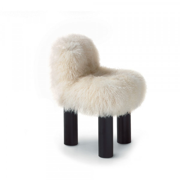
I like three-legged chairs, and the comforting clumsiness of this design in particular.
The Kazimir Pendant has a very nice play of transparency.
I like that Christopher Stuart's Chamfer Table looks like an architectural model. It has a nuanced precision and an industrial quality at the same time.
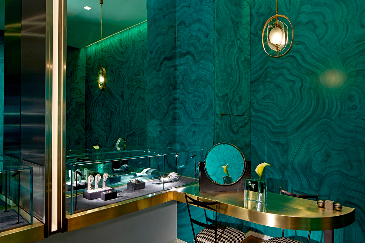
Delfina Delettrez. Photography by Mark Cocksedge.
How has your training in fashion informed your career in architecture and design? You continue to draw from this world, as well as popular culture. Can you share a few references that are on your mind?
I think working in fashion gave me a certain kind of attention to detail that is integral to the work I do now, as well as a certain perspective as a designer that I find invaluable. Architecture is often quite an insular field. Working in fashion gave me a heightened sensitivity to contemporaneity: my work now is very much about taking the fingerprint of the zeitgeist, so to speak.
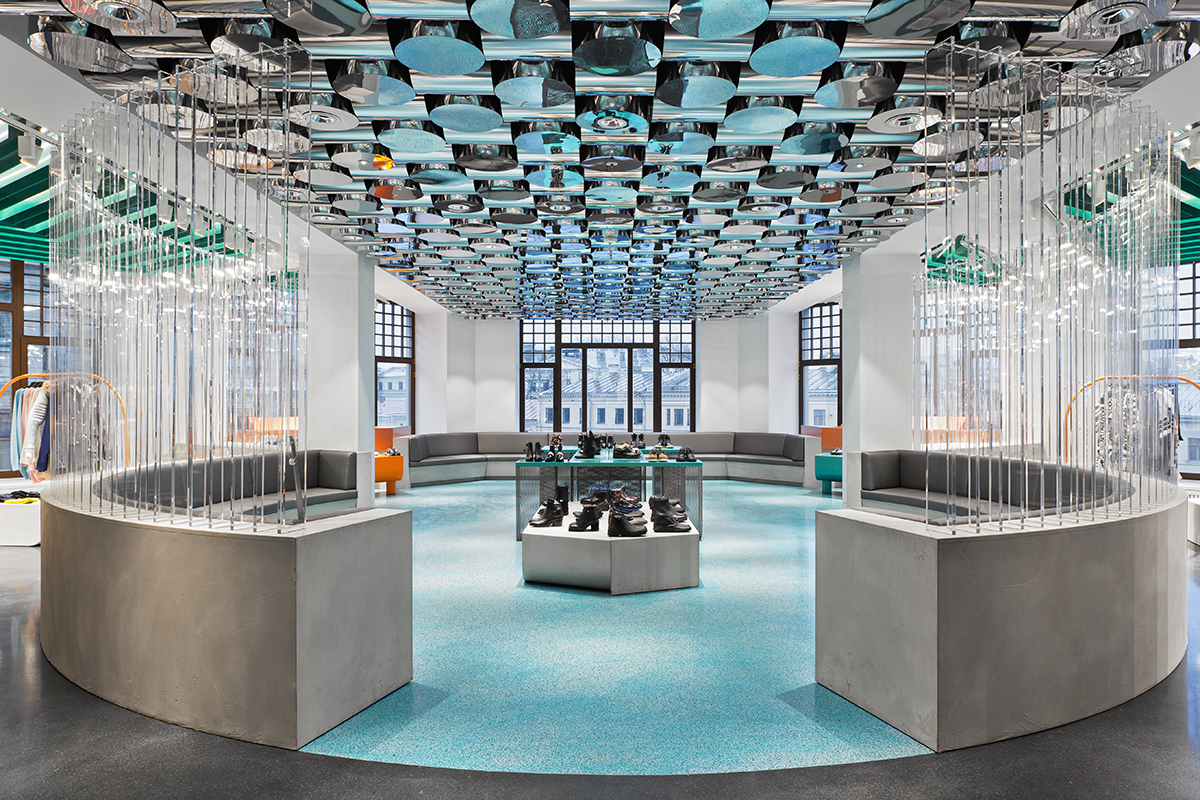
Au Pont Rouge. Photography by Alexey Bogolepov.
Given the rise of online shopping and sweeping changes to the zeitgeist with the internet - what, in your mind, do retail brands and hospitality spaces need to do to gain interest and remain relevant?
I don’t think there are any tricks to be played. A brand simply has to be authentic and well-designed and to participate in the same world as its clients or it won’t get their attention. The brands that succeed are the ones that communicate their authenticity the most effectively using the technology of the moment. COS does this well; Patricia Urquiola at Cassina; the Future Perfect!
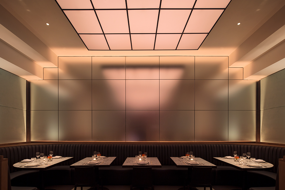
Asia de Cuba. Photography by Floto Warner.
Your projects include residential, commercial and retail. And a pretty awesome new pool complex. Can you share a recent project that you've loved and that has pushed you creatively?
Any project that pushes me is a project I love, because I look at every project as an opportunity to push myself. A large yacht we are designing right now has presented a notable, unique set of challenges, which in themselves represent quite an exciting set of opportunities. We’re working on a facade for Kenzo in Seoul, which has been quite interesting in terms of its technical aspects: we’re using very traditional means to create something very contemporary.
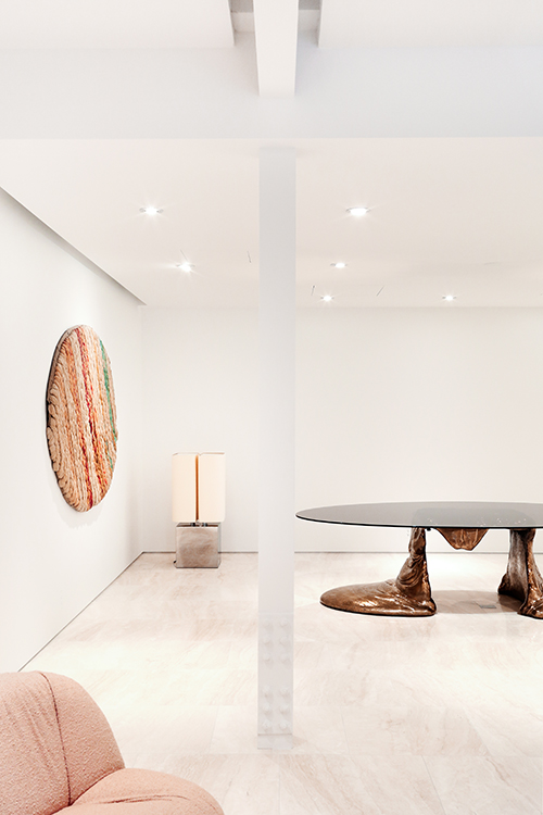
Demisch Danant. Photography by Wallo Villacorta.
Many of our Shopping With subjects are devoted travelers; where have you recently visited that you've loved? Is there a favorite hotel of yours and why (ideally from a design perspective).
Corsica. I stayed there this summer in a 500-year-old former convent. It’s a beautiful place.
In terms of hotels, Ett Hem in Stockholm marries comfort with high design particularly well. The Hotel National des Arts et Metiers in Paris, designed by Raphael Navot, is awesome. It happens to be across the street from the Balice Hertling Galerie we recently designed. The Cafe Royal in London is another favorite.
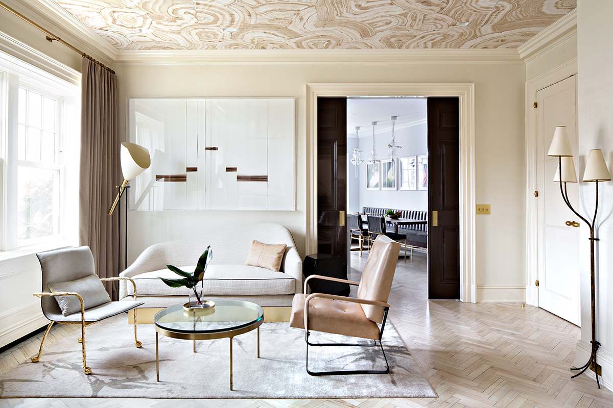
Greenwich Village Residence. Photography by Floto Warner.
In your mind what makes an ideal client?
It’s nice to have clients who aren’t totally adamant in “knowing what they want.” An ideal client is one who’s open to the dynamism of the new.
Does your approach to your own home differ to that of your clients?
My home is more of a work in progress. I think it lacks a certain amount of polish compared to some of my projects. It’s a testing ground for me, in a lot of ways.
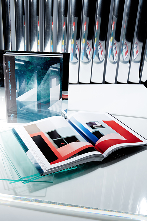
What inspired your new monograph? And what was your approach to putting it together from an editorial sense?
The book was envisioned as an overview and a celebration of the first ten years of Architecture at Large, which I founded in 2006. It’s about taking stock and examining what we’ve done so far as we move onward. The book presents all of our projects in a series of chapters that are organized by mood, rather than chronologically. In that sense it’s consistent with much of our practice, which is very much about grappling with moods and atmospheres.
 The Future Perfect


