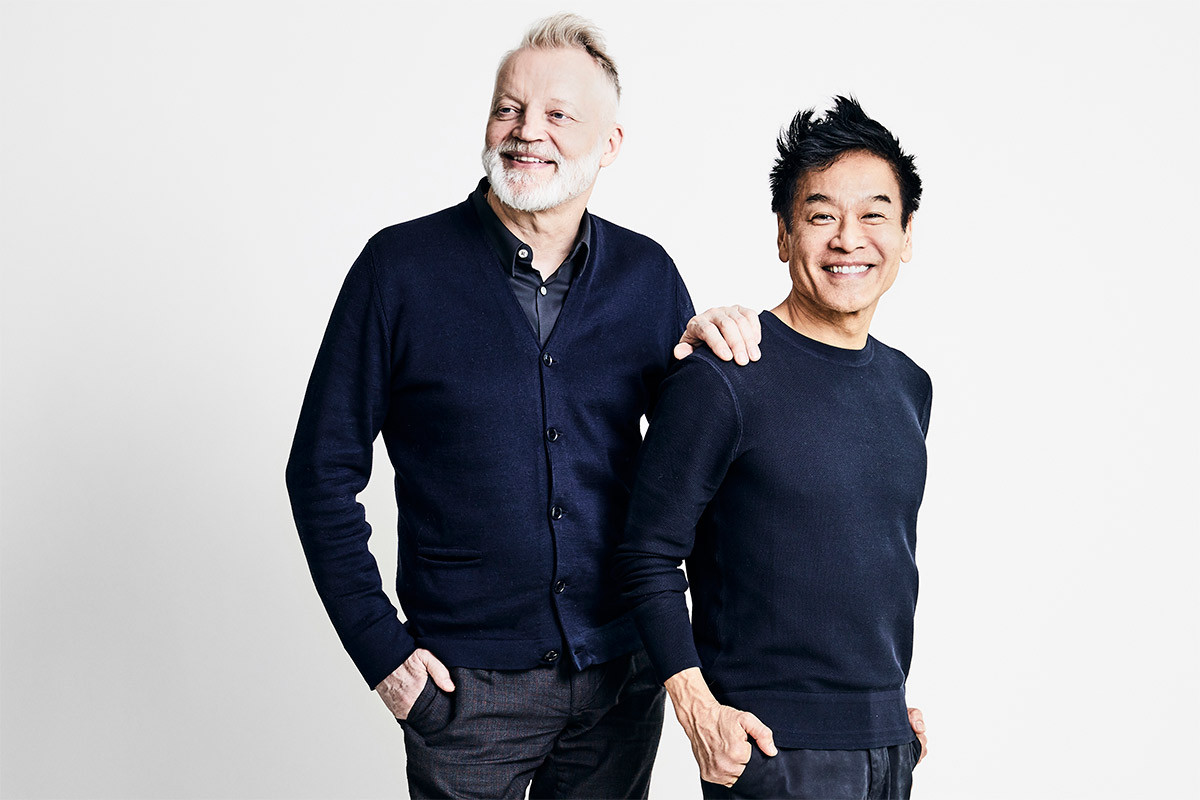
Shopping With Yabu Pushelberg
Glenn Pushelburg and George Yabu, the coolest Canucks we know, are the two gentlemen behind powerhouse firm Yabu Pushelberg. Together, Yabu and Pushelberg have created one of the world’s foremost design and interiors powerhouses, crafting endlessly creative hospitality spaces for projects including the Edition Hotel in London, The Park Hyatt in New York and the Four Seasons in Tokyo. Their work, however, extends far beyond glamorous boltholes: always shape-shifting, the studio produces furniture collections with Linteloo, conjures breathtaking retail temples for the likes of Barney’s New York and recently designed the ultracool Canada Olympic House for the 2012 Rio Games.
On their TFP picks (from left to right):
There is beauty in the absolute simplistic geometry of this bench.
The shelving unit is sculptural, delicate and ethereal; it has presence but does not overwhelm. We love that balance.
The Bounce breaks from the norms of what a lamp should be, with the parts that make up a lamp as a whole fragmented into two sections. I like the black version – because the parts are split, the black gives each piece a greater presence.
The Kyoto table reminds us of when we were young designers in the ‘80s. Kuramata was a design hero for us.
The raw, wabi-sabi aesthetic of this planter would provide a good counter-balance to a refined interior.
I love the versatility of various qualities of light in this piece: ambient up-light, downward task light, plus the addition of the quirky opalescent dots. There is beauty in its awkwardness, of the parts coming together, is its greatest appeal.
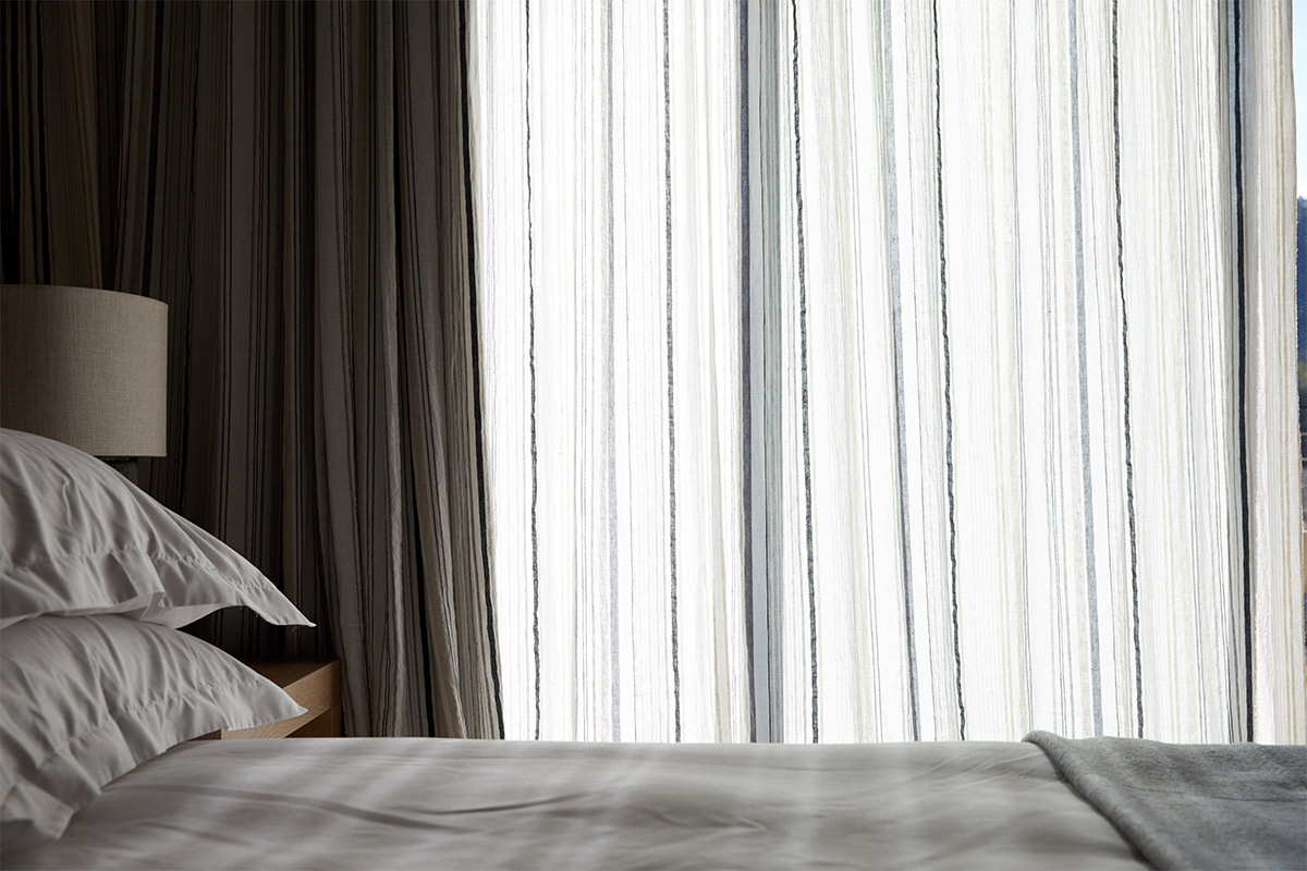
Los Alcobas Napa Valley, photography by Alice Gao.
Y.P. is prolific. Can you talk us through a recent project you’ve found particularly rewarding?
Los Alcobas Napa Valley – the first new hotel to open in Napa Valley in seven years – was designed for our dear friend Sam Leizorek. It was a truly immersive process, from influencing the site planning, controlling the sightlines and the positioning of the buildings around the lawn to helping to conceive some of the architecture. We also art-directed the art consultants (Moss and Lam created incredible custom art for the hotel), as well as designing uniforms and furniture for the entire property.
The overall feeling is not of an over-designed hotel, but is really quite effortless (which, as we know, actually requires more effort!).
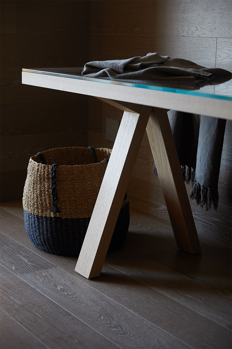
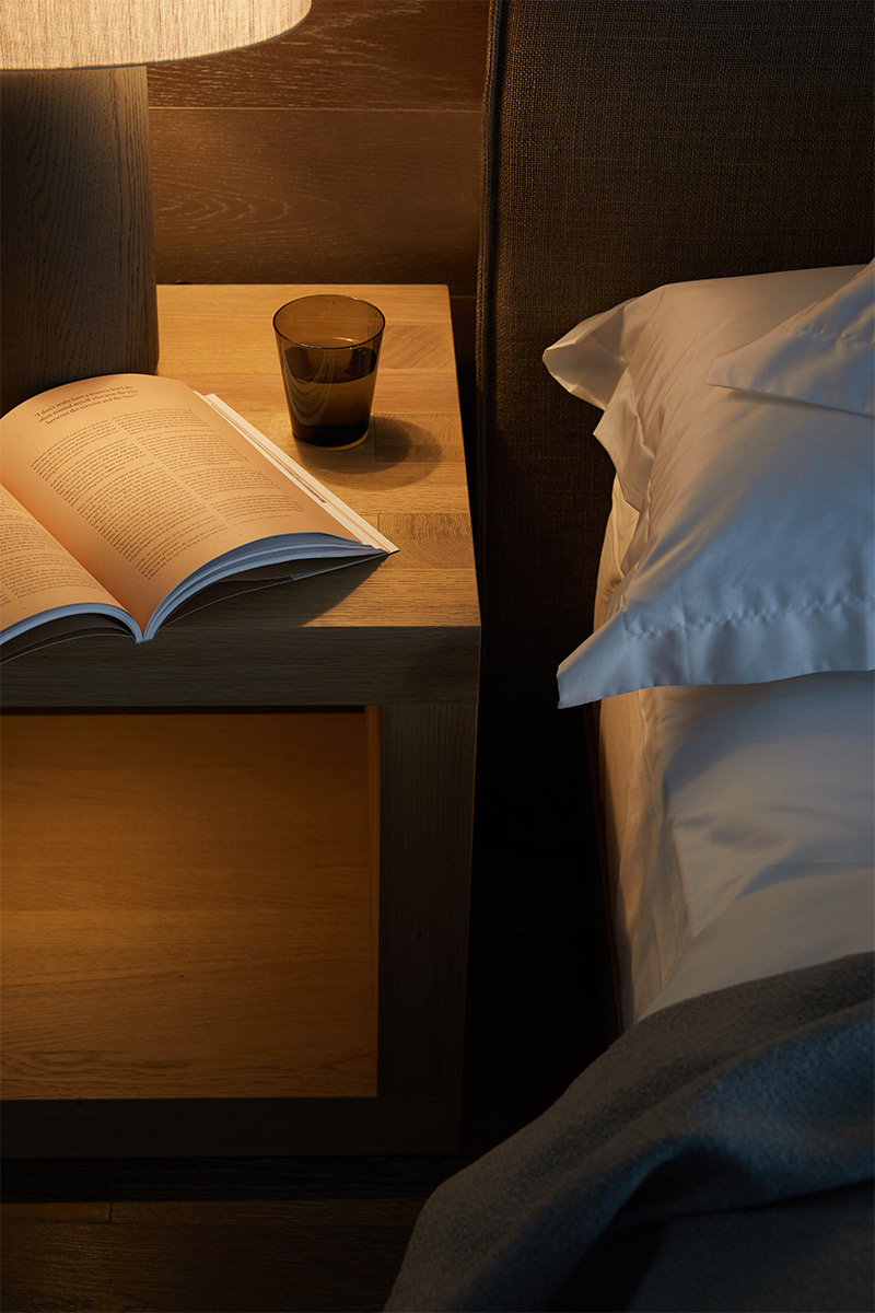
Las Alcobas Napa Valley, photography by Alice Gao.
You are probably the most well-traveled gents I know. Anywhere you’ve been recently that’s been particularly inspiring?
Revisiting Bangkok! On the surface, the growth and development in Bangkok is striking, and not always pretty, as compromised examples of modern architecture abound. But what is really compelling is happening at street level. Arguably Asia’s most progressive city, you can find a lot of wonderful people/entrepreneurs doing really interesting things. There is an absolute acceptance of modern, contemporary design which, fused with local culture, leads to wonderful results. We’ve come across art that’s really worth looking at hanging on the walls of a coffee shop – something that we haven’t found anywhere else in the world.
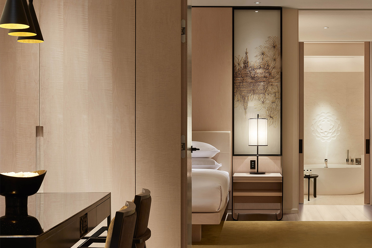
Park Hyatt Bangkok; courtesy of Park Hyatt.
We don’t collect for the sake of collecting, or acquiring certain names, or for financial investment (although it’s a nice side benefit), or even to fill a blank wall.
Art has always been a key component of YP’s work and you collect personally. Which artists would you list as favorites and any recent discoveries?
Our personal art collection spans the spectrum of geography, medium and value. We don’t collect for the sake of collecting, or acquiring certain names, or for financial investment (although it’s a nice side benefit), or even to fill a blank wall. Our collection has grown organically over time, often when we buy something we don’t really have a place in mind to put it, but that always comes.
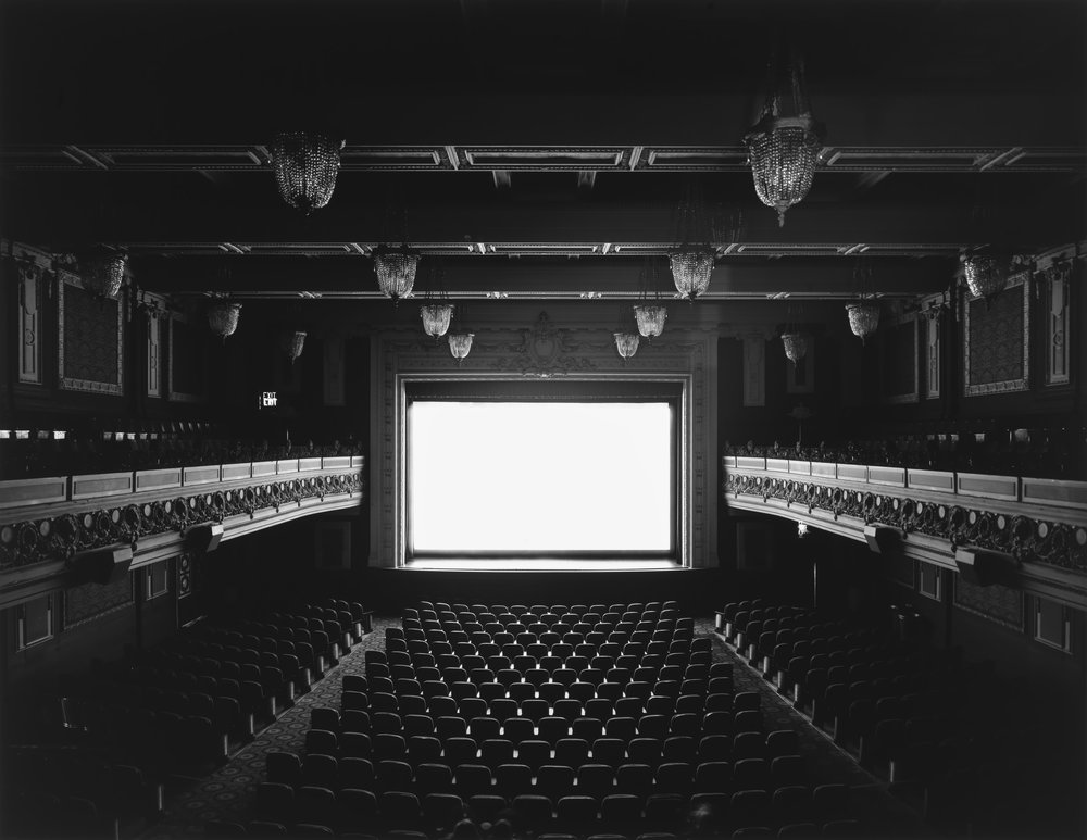
Regency Theater, San Francisco (1992) by Hiroshi Sugimoto. Photography courtesy of Hyperallergic.
We also really love Japanese photographer Hiroshi Sugimoto; particularly his lightning fields series, which are actually not photos at all, but produced with electric charges over photo paper on a large metal tabletop. They’re richly textured, and there is an incredible tension between the nuanced detail and bold subject matter.
Sometimes we feel a great connection to a piece of art because of the connection to where we bought it, or a connection to the artist, or simply because a piece is really beautiful.
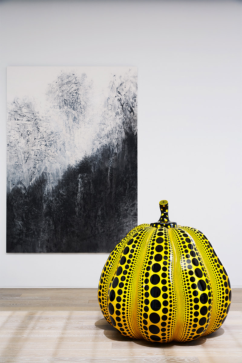
Our most recent acquisition is a large-scale digitally rendered photograph by Vancouver-based artist Stan Douglas. It is moody, mysterious and layered and represents a make-believe look at urban Vancouver circa 1948. Sometimes we feel a great connection to a piece of art because of the connection to where we bought it, or a connection to the artist (meeting artist Yayoi Kusama sealed the deal for us), or simply because a piece is really beautiful. Sometimes the technique and craft is more intriguing than the composition, content or intellectual value, as with a small Rajasthani depiction of a window in our collection.
Photography courtesy of Yabu Pushelberg.
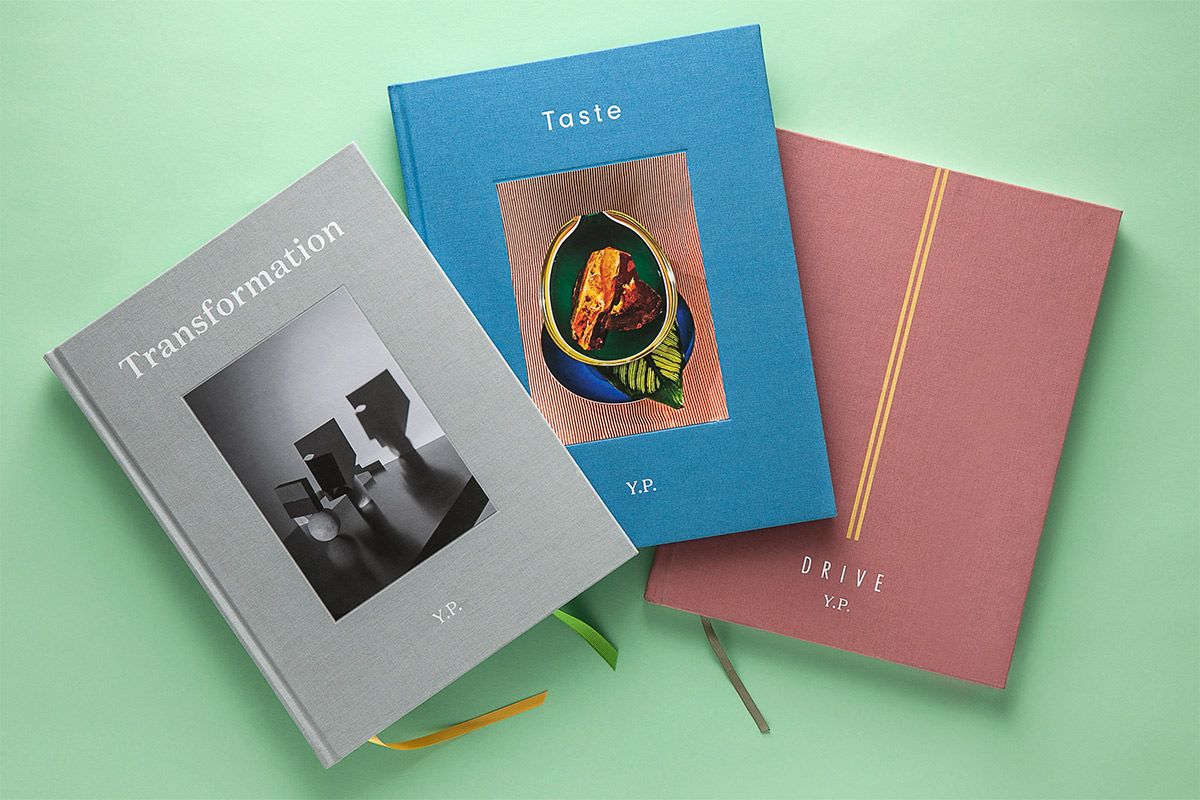
Your journal Y.P. is an immersion into some of your favorite topics and is described as a ‘bookazine.’ Can you talk us through the inspiration and genesis for the project?
A few years back, all kinds of people were telling us we should do another monograph. Frankly, the whole idea bored us, because we’re far more interested in the future and in what comes next, than in looking at the past. We started thinking about those two things in context: a book, about our future. This evolved into what has become a bi-annual publication (a bookazine called Y.P.) that explores people, places and things we are interested in or inspired by, and want to share with others. We thought it would be fun if each issue was centered on a theme, which we would then deconstruct through images and text in a way that was a reflection of the way we think and what we think about. Like everything we do, this is constantly evolving. We’re very proud with the fact that with each issue we get better and better at expressing ourselves and the content has become even richer. We were told once that we should never go into publishing - that it’s a dying trade, but we believe we’re on to something.
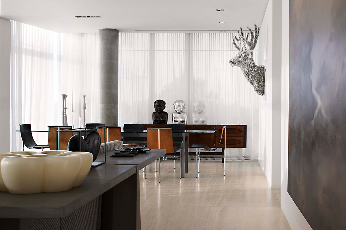
Perry Street Residence; photography by Evan Dion (art includes Gao Brothers, Zhou Fan, Kohei Nawa, Anish Kapoor.)
 The Future Perfect


